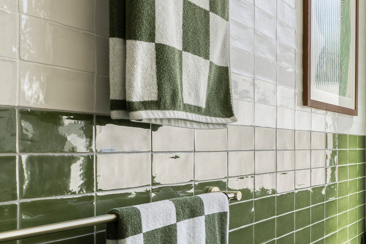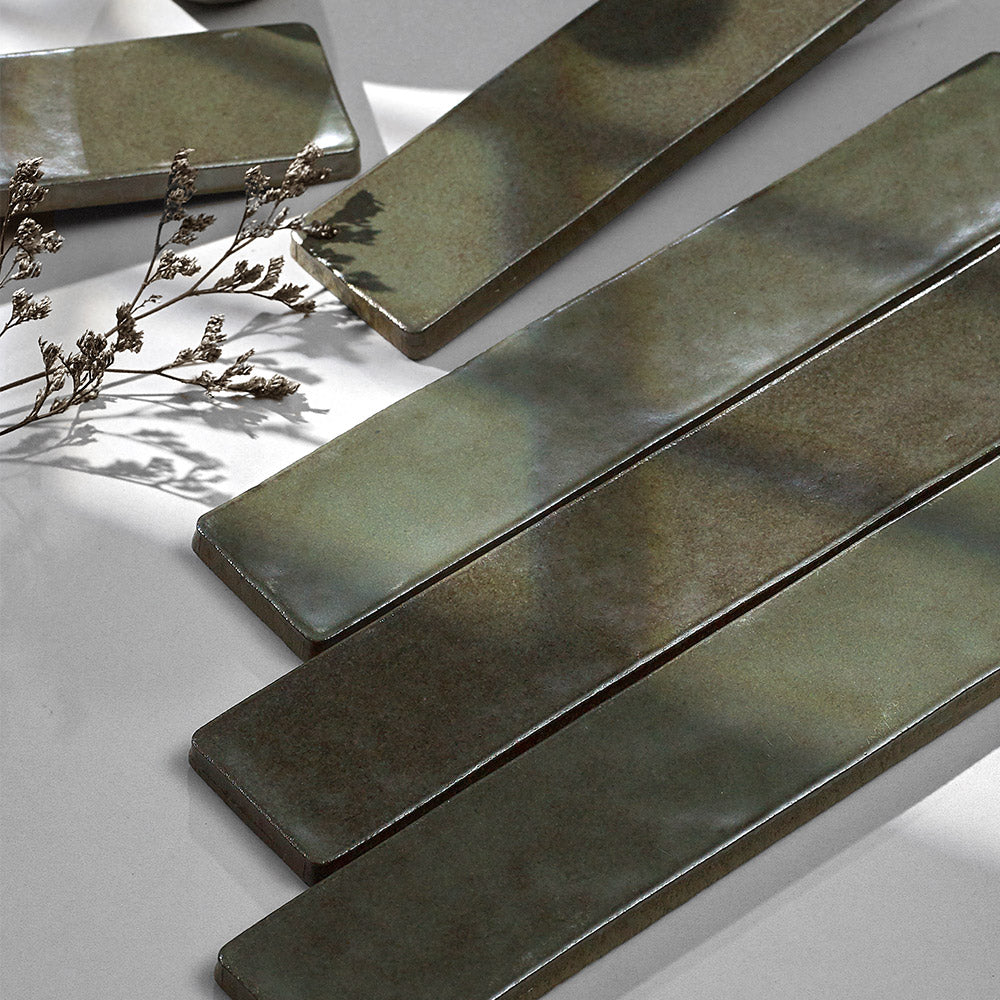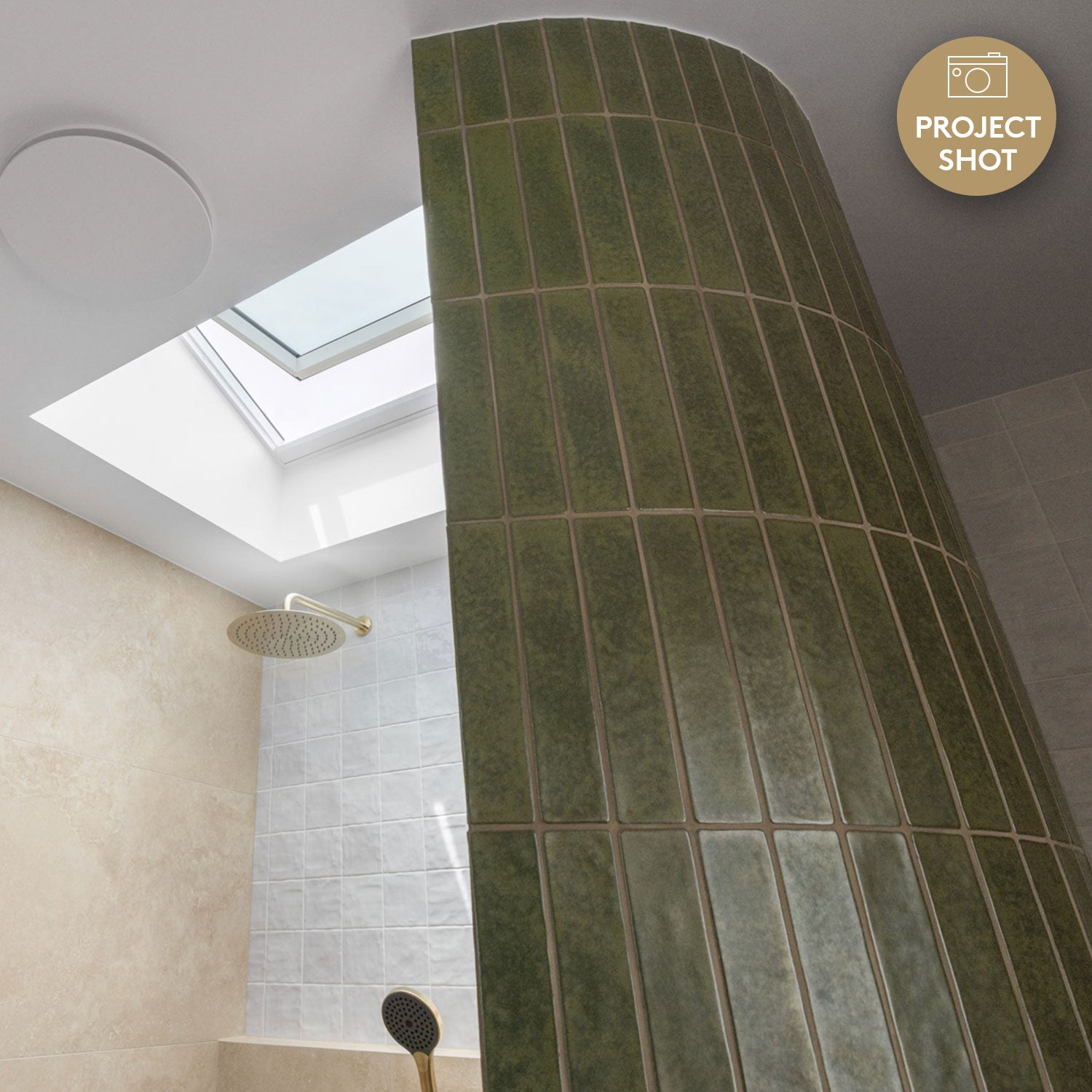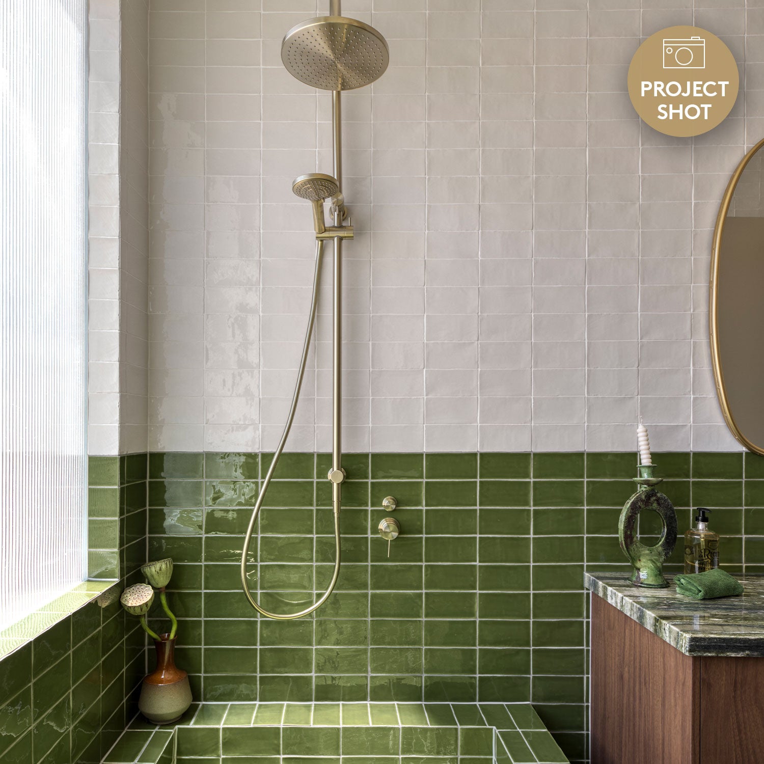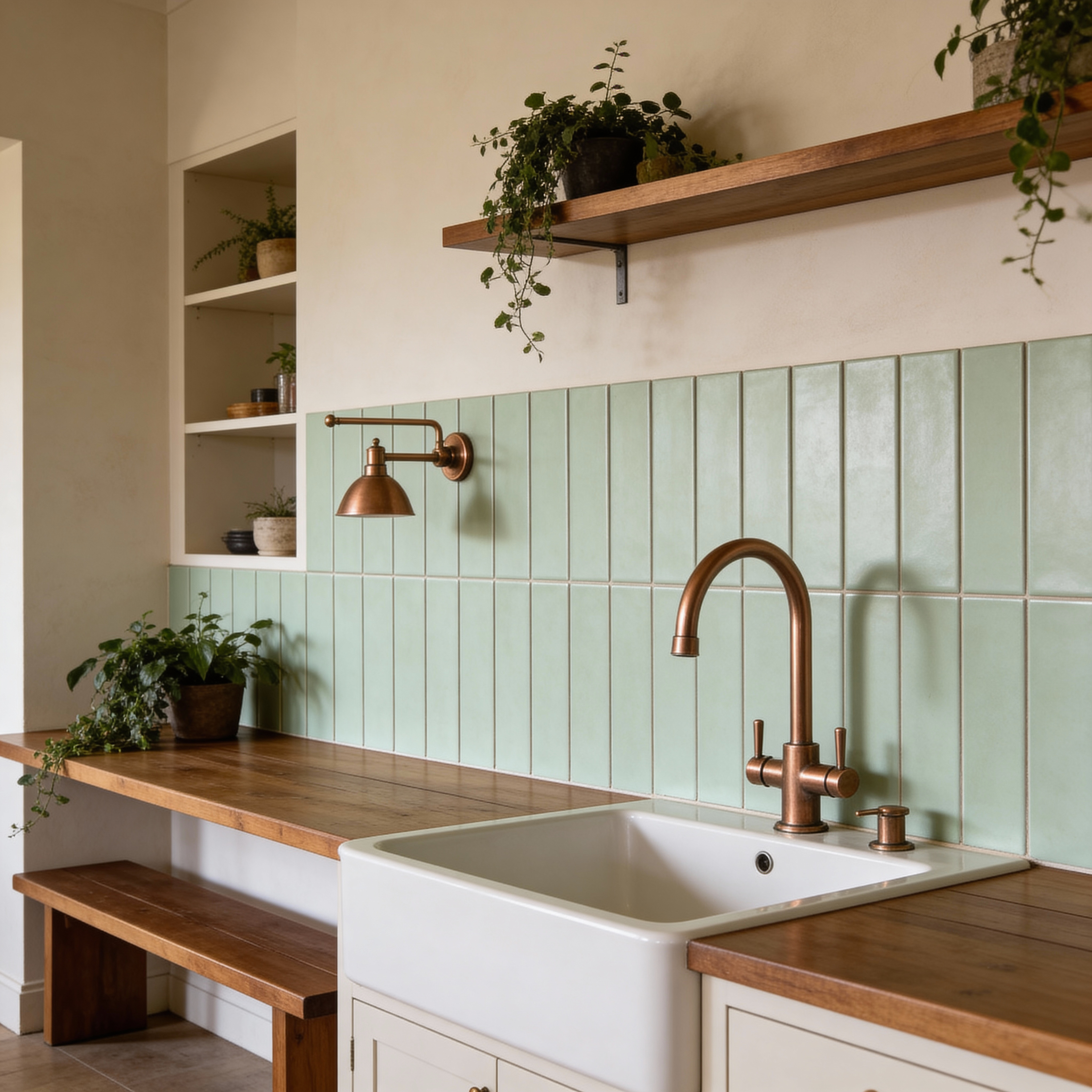

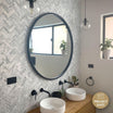
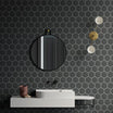
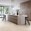
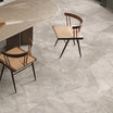

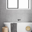
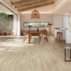

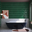
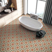
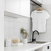
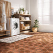

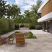
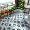




























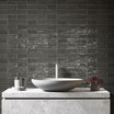
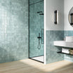
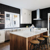
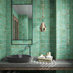
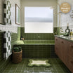

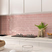
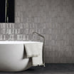
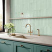

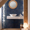
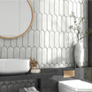
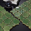
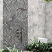
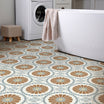
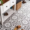
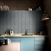
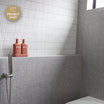
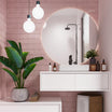
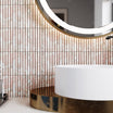
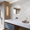
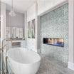
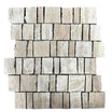
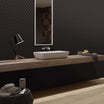
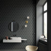
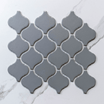
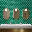
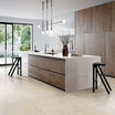
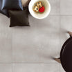
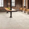

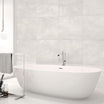
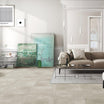
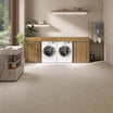





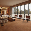
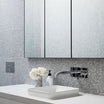
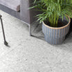


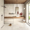
Walk into almost any newly renovated Australian home right now and there's a good chance you'll spot it: a wall of glossy emerald subway tiles behind the stovetop, a soft sage floor in the ensuite, or a run of olive zellige framing a vanity. Green has quietly become the colour of choice for interior designers, and nowhere is that more obvious than in tiles.
After more than a decade of all-white bathrooms and grey-on-grey kitchens, homeowners are craving spaces that feel warmer, calmer and more personal. Green delivers all three. In this article, we look at why designers keep reaching for green tiles, which shades are leading the way, and how to bring the trend into your own home so it still feels right years from now.
Green brings the outdoors in
The biggest driver behind the green tile movement is biophilic design: the idea that we feel better when our homes connect us to nature. Green is the colour we most associate with leaves, gardens and open space, so using it on large surfaces like walls and floors gives a room an instant sense of life.
This matters more than ever. Many of us now spend more time at home, working, cooking and unwinding in the same few rooms. Designers are responding by creating spaces that feel restorative rather than purely functional, and green is one of the easiest ways to do it.
It also suits the way Australians live. Our homes are built around indoor-outdoor flow, with kitchens opening onto decks and bathrooms looking out to courtyard gardens. Green tiles echo the eucalypts, ferns and native plantings outside, so the boundary between inside and out feels softer.
A calmer kind of colour

Green sits in the middle of the colour spectrum, and it's widely seen as one of the most balanced and easy-to-live-with hues. It has enough presence to add personality, but it rarely feels loud or tiring the way some bold colours can.
That makes it ideal for rooms where you want to slow down. A green-tiled bathroom feels like a retreat, and a green splashback can bring warmth to a kitchen without overpowering it. For homeowners who want colour but are nervous about committing, green is often the gateway.
Why green looks so good in tile
Green paint is lovely, but green tile has something paint can't match: depth. Glazed tiles catch and reflect light, so the colour shifts through the day, looking bright and fresh in the morning and richer and moodier by evening.
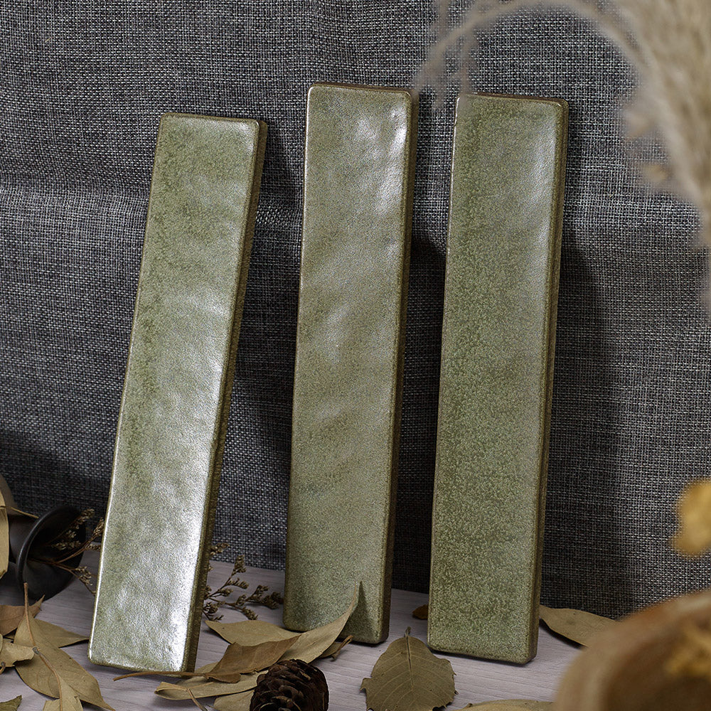
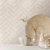
Handmade-look and zellige-style tiles take this further. Their slight variations in tone, edge and surface mean no two tiles are exactly alike, and green shows off that variation beautifully. A wall of them reads as one colour from across the room, then reveals a dozen subtle shades up close.
Finish plays a big part too. A high-gloss green feels glamorous and a little retro, while a matte or satin finish gives a softer, more organic look. Because tile is durable and easy to clean, you can use these colours in wet, high-traffic areas where paint simply wouldn't last.
The shades leading the trend

Green isn't one colour, it's a whole family, and part of its appeal is that there's a shade to suit almost any style.
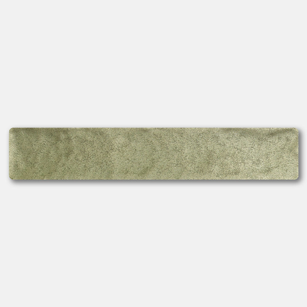
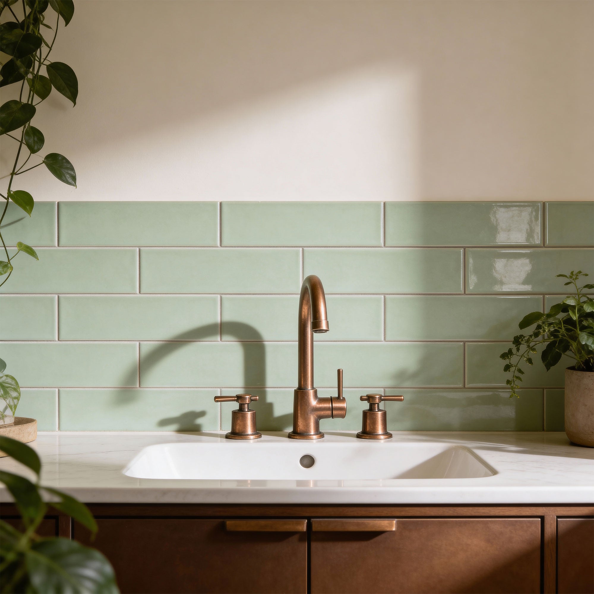
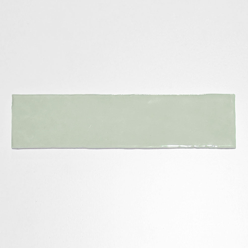
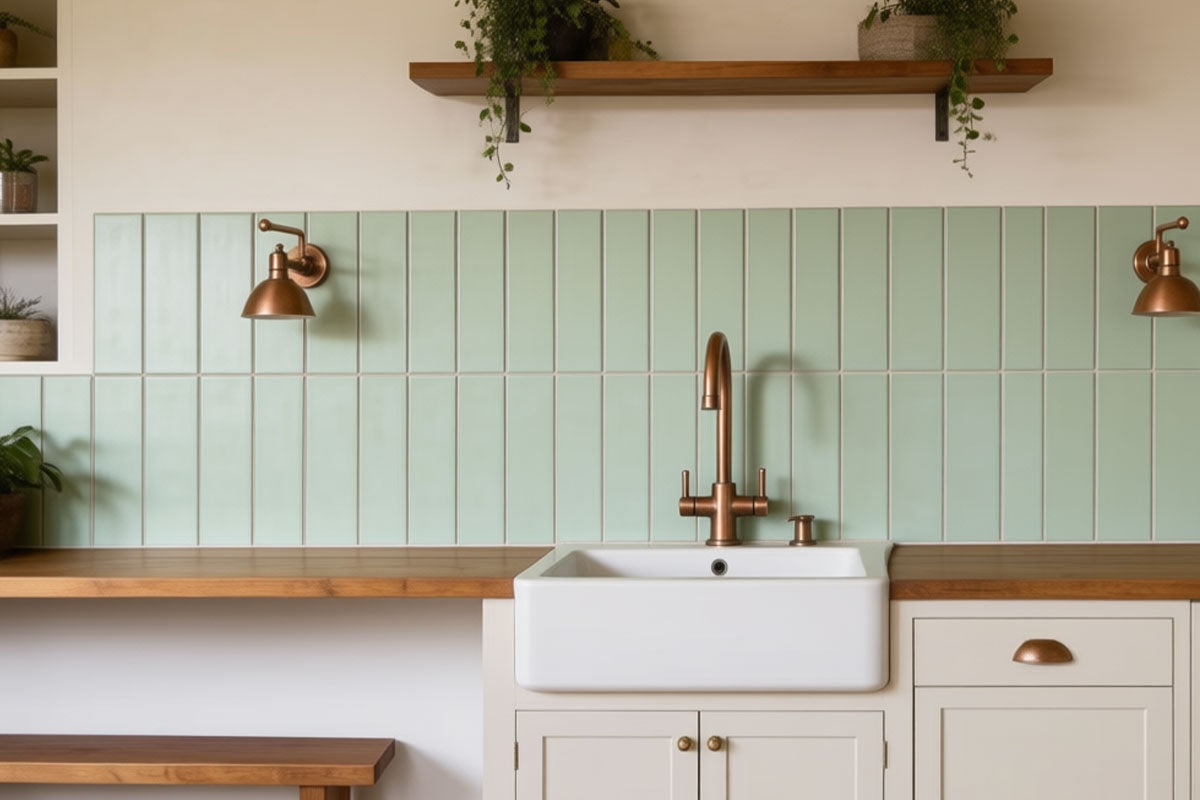
Sage is the soft, grey-tinged green that has become a modern neutral. It's gentle enough for a whole bathroom and pairs effortlessly with white, timber and brushed nickel.
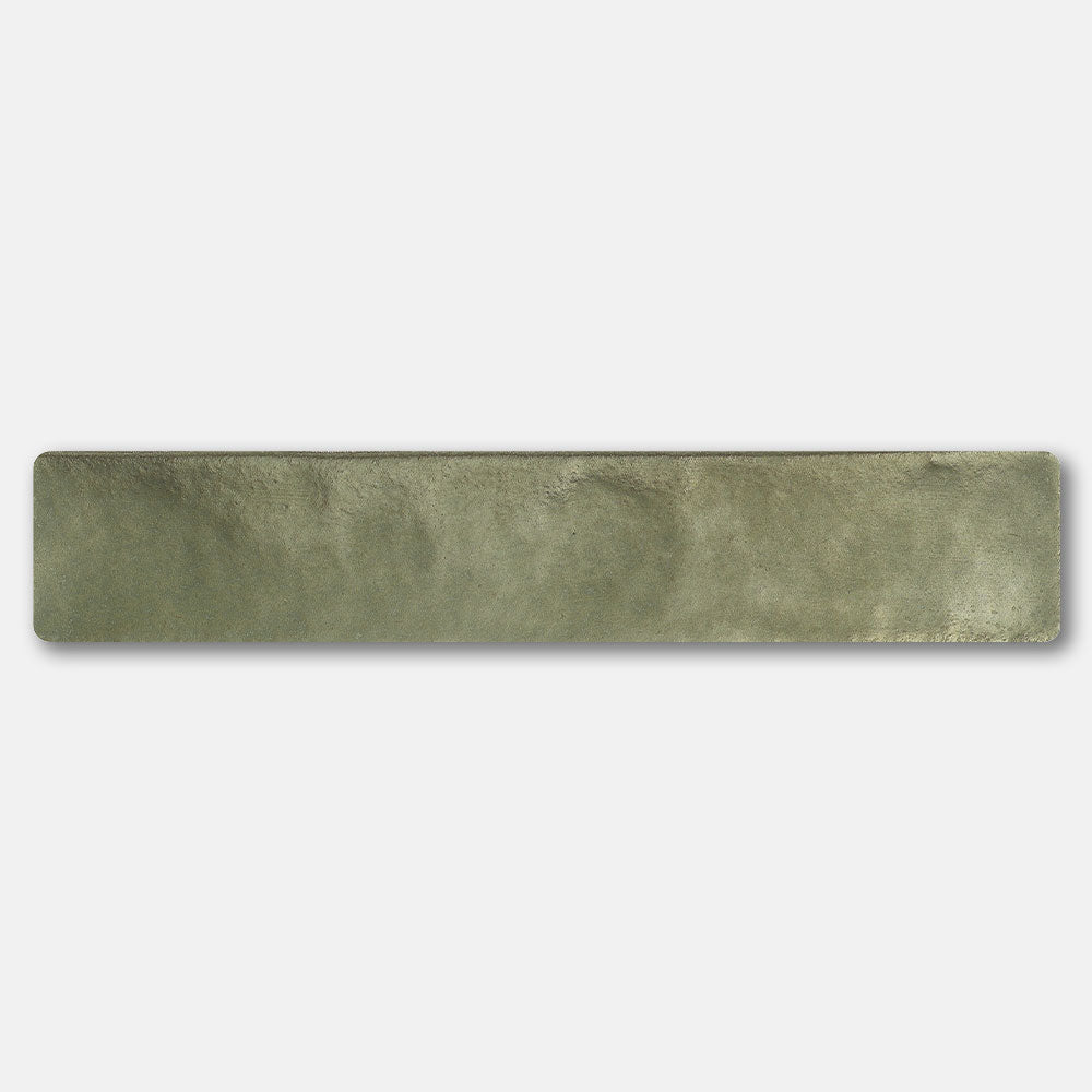
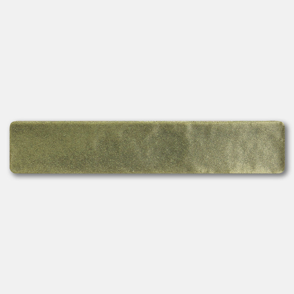
Olive is earthier and warmer, with a hint of brown or yellow. It suits Mediterranean, rustic and mid-century interiors, and looks especially good in handmade or matte finishes.
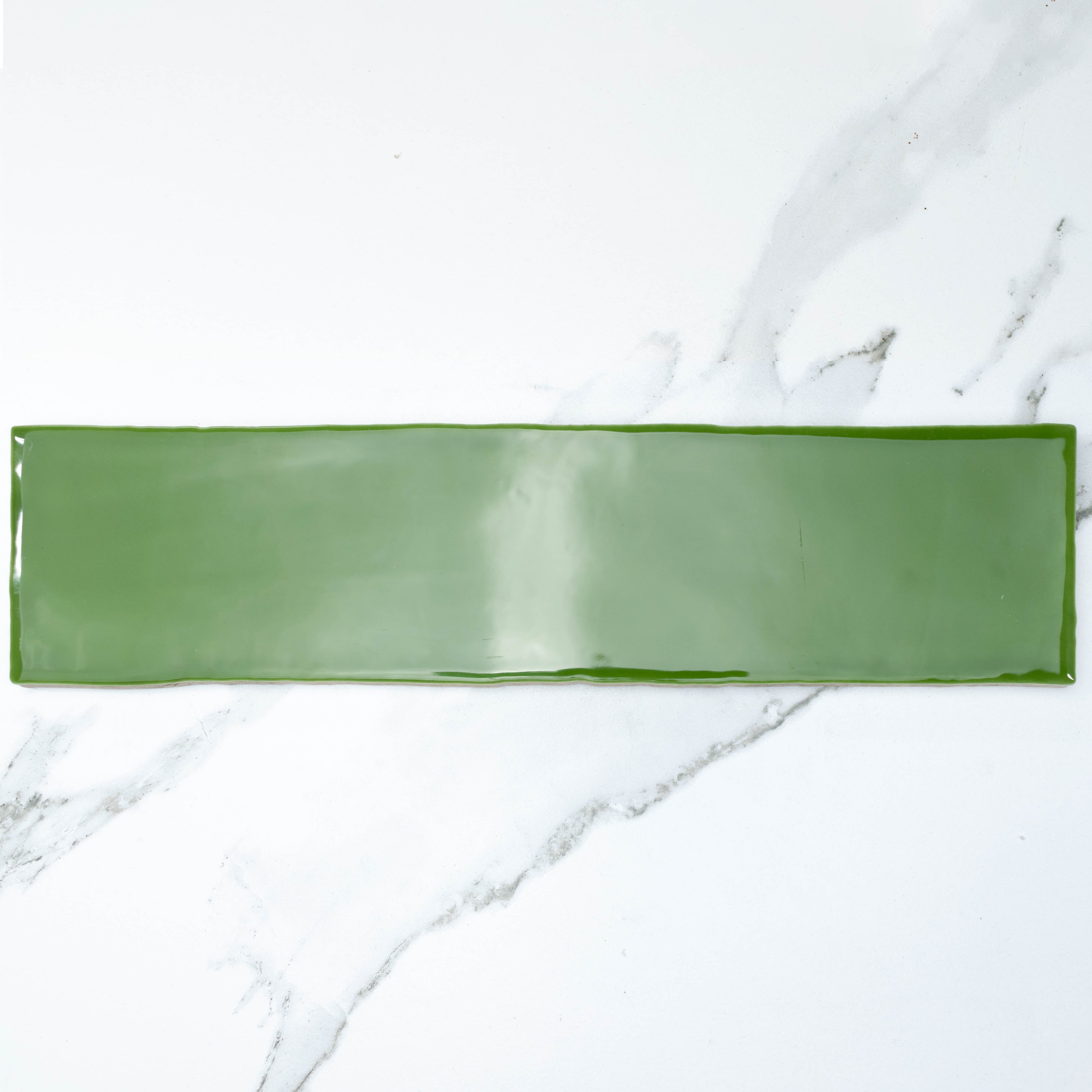
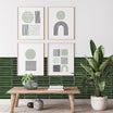
Emerald is the showstopper. Deep, jewel-toned and often glossy, it's perfect for a statement splashback, powder room or feature wall where you want real impact.
Forest and bottle green are dark and moody, creating a cocooning, luxurious feel. They work beautifully in small spaces and alongside brass fittings.
Eucalyptus and mint are cooler, lighter greens with a fresh, airy quality. They're a natural fit for coastal homes and for anyone who wants colour that still feels bright.
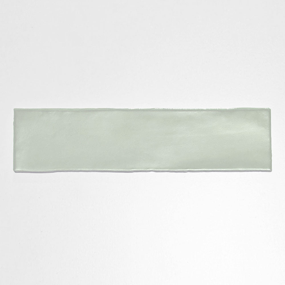
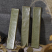
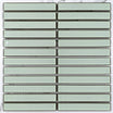
If you want to explore these shades in one collection, start with Tile Lane's Mykonos range. These handmade-look 50x250mm subway tiles have the gentle tonal variation and soft edges of zellige, so every wall carries the depth that makes green so appealing.
Where to use green tiles

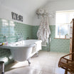
Bathrooms and ensuites. This is where green really shines. Try sage or eucalyptus on the walls for a spa-like feel, or go bold with a deep green shower niche or feature wall against otherwise neutral tiles.
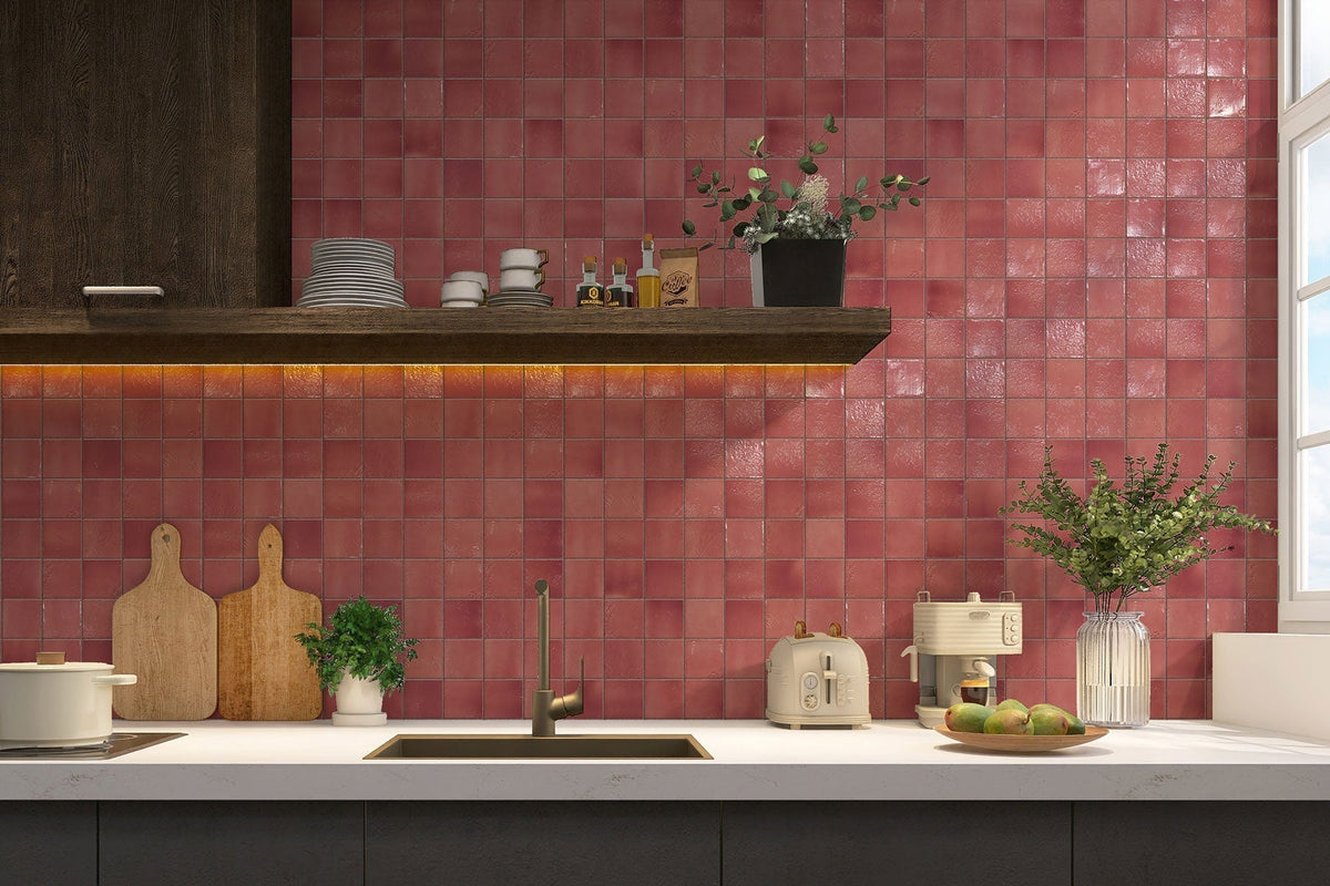
Kitchen splashbacks. A green splashback adds personality without a full renovation. Glossy emerald or forest subway tiles look striking against white or timber cabinetry, while sage keeps things light and relaxed.
Laundries and powder rooms. Small, often-overlooked rooms are the perfect place to experiment. Because you don't spend hours in them, you can afford to choose a darker or more adventurous shade.
Feature walls and fireplaces. Green tiles around a fireplace or on a single living-area wall create a focal point that feels considered rather than flashy.
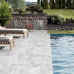
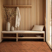
Outdoor and alfresco areas. Choose a suitably rated outdoor tile in an olive or muted green to link your entertaining area with the garden beyond.
How to style green tiles
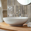
Pair with natural materials. Timber, stone, rattan and linen all sit comfortably beside green because they share the same nature-inspired palette. Oak vanities and green walls are a particularly popular combination.
Choose your metals carefully. Brass and brushed gold warm up deeper greens and add a touch of luxury. Matte black gives a sharper, more contemporary edge, while chrome and nickel keep paler greens feeling crisp.
Balance with neutrals. If you're new to colour, use green on one surface and keep the rest simple. A green wall with a white or terrazzo floor, or a green floor with white walls, feels fresh and easy to live with.
Think about grout. A matching or tonal grout lets the colour read as one smooth surface. A white grout highlights the shape of each tile and suits classic subway and herringbone layouts. A darker grout can be more forgiving in floors and splashbacks.
Play with format and layout. The same green can look completely different depending on the tile. Vertical stack bonds feel modern, herringbone feels classic, and small mosaics or fish-scale shapes add texture and movement.
Is green just a passing trend?
It's a fair question, especially when tiles are meant to last for years. The good news is that green has a long history in interiors, from Victorian-era tiled hallways to the glossy kitchens of the 1950s and 70s. It keeps returning because it's rooted in nature rather than a fleeting fashion.
To make your choice feel timeless, lean towards softer, earthier greens like sage and olive for large or permanent surfaces such as floors and full bathroom walls. Save the boldest emeralds and bottle greens for splashbacks, powder rooms and feature areas, which are easier to update down the track. Classic shapes like subway, square and herringbone also help green tiles age gracefully.
Bring green into your home
Green tiles have earned their place in modern interiors because they do something few other colours can: they make a home feel calmer, warmer and more connected to the world outside. Whether you're drawn to a whisper of sage or a bold sweep of emerald, there's a green to suit your space and your style.