







































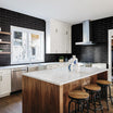
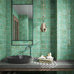
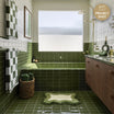

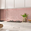
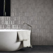
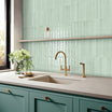
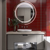

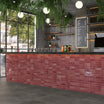
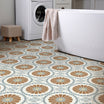
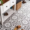
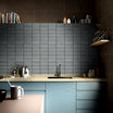
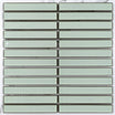
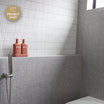
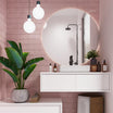
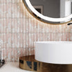
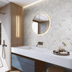






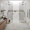

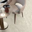





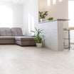



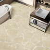








On any tiling project grout can be a big share of what the eye actually sees, yet most people choose it in seconds. This is especially true when it comes to small tiles and mosaics. Interior designers treat it as part of the tile, not an afterthought. The right colour can make a budget tile look custom; the wrong one can make a premium tile look cheap.
Here's how designers approach the decision, angle by angle.
Start with one question: what's the grout's job?
Designers decide the grout's job before they look at a single colour chart. There are three options.
1. Blend (match the tile)
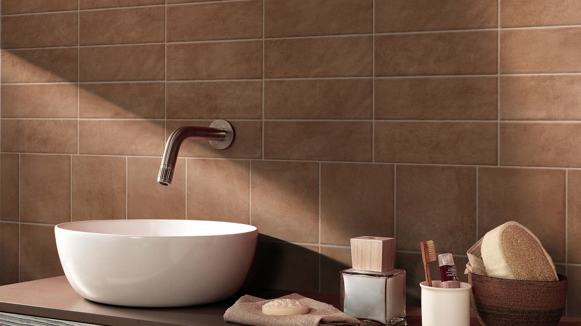
- Effect: joints disappear and the surface reads as one calm plane.
- Best for: small rooms, busy patterns, natural stone, large-format tiles.
2. Contrast (clearly lighter or darker)
- Effect: the grid becomes a design feature.
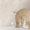
- Best for: herringbone, chevron, fish scale, classic subway.
3. Tone (a shade or two off the tile)
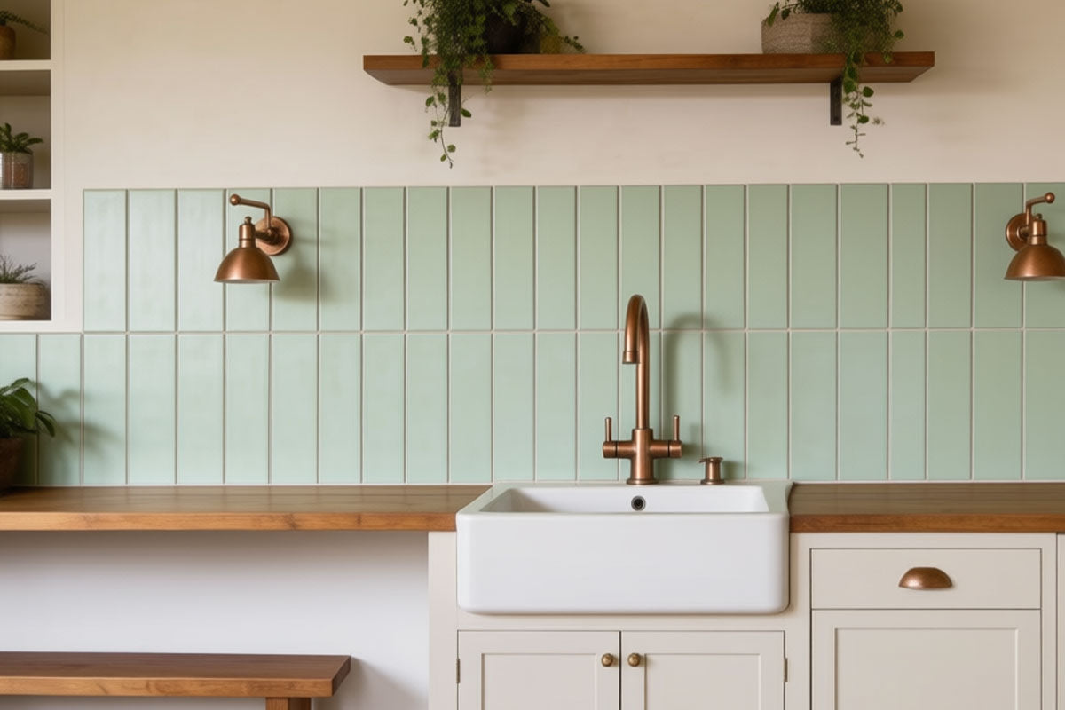
- Effect: joints are visible but soft.
- Best for: most everyday spaces. It's the default many designers reach for.
12 Angles to Consider
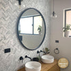
1. Tile shape and pattern
- The rule: A feature lay deserves contrast; large-format tiles deserve a match.
- Why: Contrast traces the pattern, while matched grout keeps big tiles reading as one surface.
- Watch out: Herringbone in matching grout can look like a plain floor.
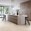
2. Room size
- The rule: Small rooms get matched grout; large rooms can take tonal grout.
- Why: A visible grid stops the eye and shrinks a space.
- Watch out: In big open-plan areas, fully matched grout can make floors look flat.
3. Lighting
- The rule: Judge grout in the room it's going into, morning and night.
- Why: Warm LEDs push greys toward beige; south-facing light can turn white grout bluish.
- Watch out: Showroom lighting rarely matches home lighting.
4. Traffic and mess
- The rule: Floors get mid-tones or a shade darker than the tile; walls can go lighter.
- Why: Light floor grout darkens unevenly, often within months.
- Watch out: Kitchens and entries are the worst offenders.
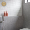
5. Wet areas
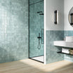
- The rule: Showers get soft grey or tile-matched grout.
- Why: Pure white shows soap scum and mould first.
- Watch out: A dark grout can show white soap and mineral residue instead.
6. Undertone
- The rule: Warm with warm, cool with cool.
- Why: Mismatched undertones make grout look dirty rather than designed.
- Watch out: A cool blue undertone grey beside a creamy tile is a common mistake.
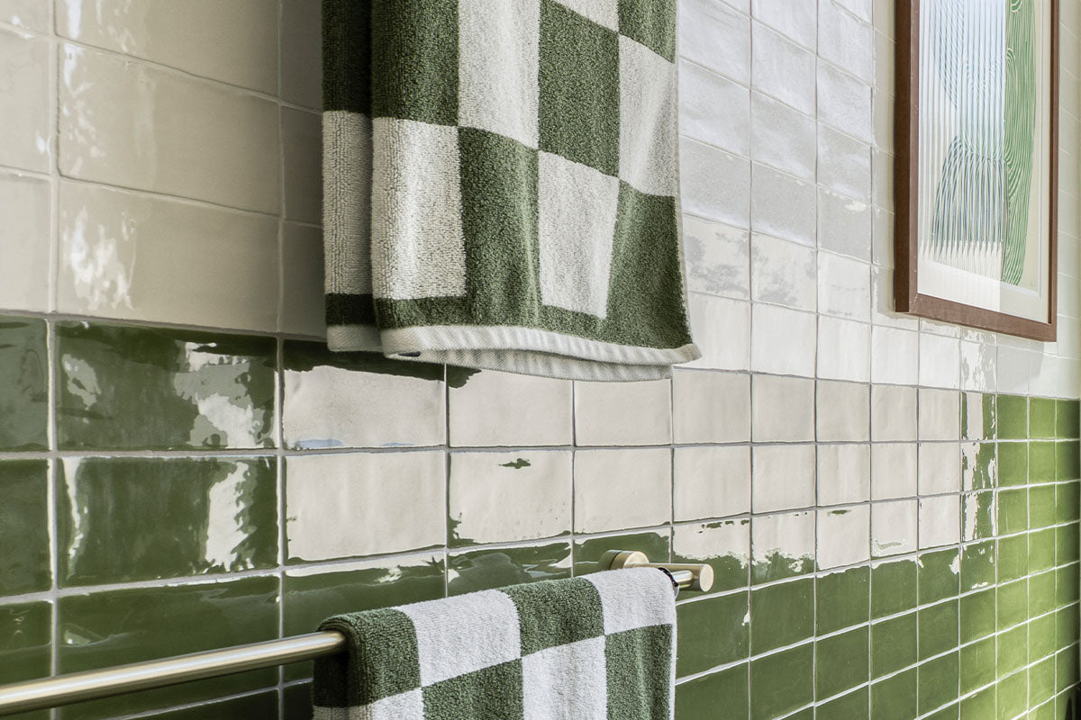
7. Natural stone, terrazzo and zellige
- The rule: Match the base colour, not the veining or flecks.
- Why: The material is the feature; grout should support it.
- Watch out: On handmade tiles like zellige, contrast grout fights the glaze variation.
8. Fixtures and finishes
- The rule: Let grout echo the room's hardware and joinery.
- Why: It ties the scheme together quietly.
- Examples: Charcoal grout with black tapware; warm sand with brushed brass and timber.
9. Continuity across the home
- The rule: Keep one grout family where tiles flow between rooms.
- Why: Switching colours room to room makes a house feel pieced together.
- Watch out: Bathroom, ensuite and laundry are often seen in one sightline.
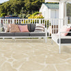
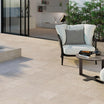
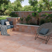
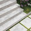
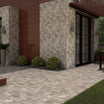
10. Outdoor areas
- The rule: Mid-to-dark, close to the tile colour.
- Why: Dirt, leaves and pool chemicals beat light grout every time.
- Watch out: High contrast outdoors highlights every uneven joint.
11. Resale
- The rule: Neutral and tonal if selling within a few years.
- Why: Buyers forgive a bold tile more easily than a bold grout.
- Watch out: Grout is cheap to choose but costly to change later.
12. Trends
- The rule: Coloured grout (terracotta, sage, pink) belongs in small, easy-to-redo zones.
- Why: It looks fresh now, but trends move faster than renovations.
- Best spots: Kids' bathrooms, powder rooms, feature splashbacks.
Practical Checks before Committing
Test it dry
- What designers do: Ask the tiler to grout a few spare tiles on a board and let it cure.
- Why: Grout usually dries a different shade from how it looks freshly mixed.
Consider joint width
- What designers do: Factor the joint size into how bold the colour can go.
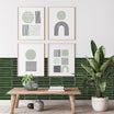
- Why: A 2 mm contrast joint is subtle; a 5 mm one is a statement.
Pick the right grout type
- Epoxy: Holds colour and resists stains. Worth it for showers, kitchens and light colours.
- Cement-based: Easier to work with and fine for most walls.
Seal it
- What designers do: Specify sealing for cement-based grout, especially on floors.
- Why: Unsealed light grout is the fastest route to regret.
Ask the tiler
- What designers do: Check which shades in the tiler's preferred brand look true to the chart.
- Why: Printed and on-screen swatches are often off.
Quick Cheat Sheet
|
Space or tile |
Designer pick |
|---|---|
|
A small bathroom |
Grout matched to the tile |
|
Herringbone, chevron or subway as a feature |
Contrast grout |
|
Large-format floor tiles |
Matched grout, narrow joints |
|
A kitchen or entry floor |
Mid-tone or a shade darker than the tile |
|
A shower recess |
Soft grey or tile-matched, ideally epoxy |
|
Marble or natural stone |
The stone's base colour |
|
Handmade or zellige tiles |
Matched grout |
|
Outdoor pavers |
Mid-to-dark, close to the tile |
|
A home going to market soon |
Neutral, tonal grout |
The safe default: one shade darker than the tile, in the same undertone. It's forgiving, hides wear and looks considered in almost any room.